FIRST METHODIST HOUSTON
First Methodist Houston is Houston’s oldest church, and first moved into their current building downtown in 1890. It’s a building chock-full of history, from several one-of-a-kind stained glass pieces, to a century-old prayer rail rescued from fire, to the oldest operating elevator in the city. It’s a church that’s proud of who it is and who it’s been.
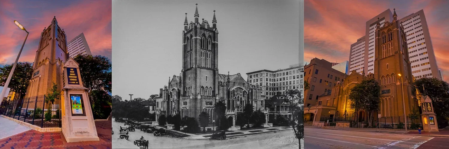
The Current Design
I arrived as Art Director in 2020 the graphic design for the church did not match the church’s aesthetic. The church’s logo looked like this:
It was a simple design—more of an organizational nameplate than a true logo. While it could be applied to virtually anything, it didn’t capture the energy or personality of a church located in the heart of a major city. I wanted to create a logo that brought the church to life and better reflected its identity and sense of place.
We followed that effort by moving our overall design direction toward sleeker, more modern work that incorporated greater personality, energy, and visual storytelling. As a result, our team was eventually given the opportunity to explore new branding concepts for the church.
Knowing we might only get one opportunity to make the case for a new identity—and that our window of time was limited—we developed a presentation featuring a variety of creative directions. Our goal was to demonstrate just how many possibilities were available and, hopefully, build enough excitement and enthusiasm among church leadership to move the conversation forward.
Pitch 1: Cleaning Things Up
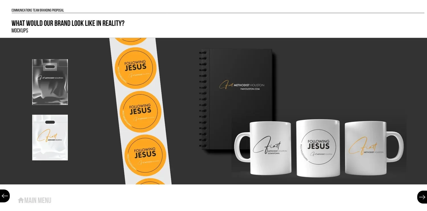
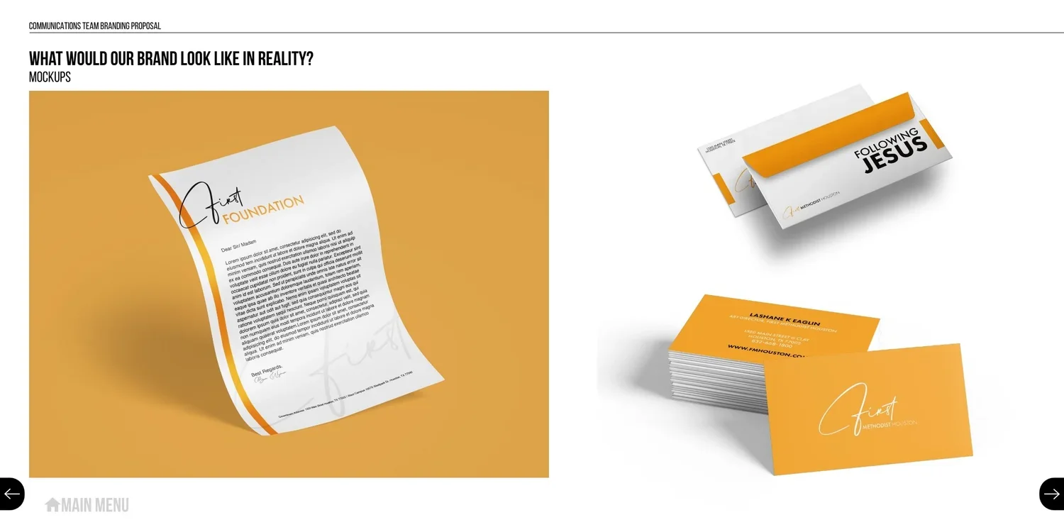
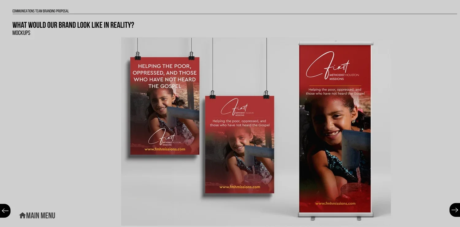
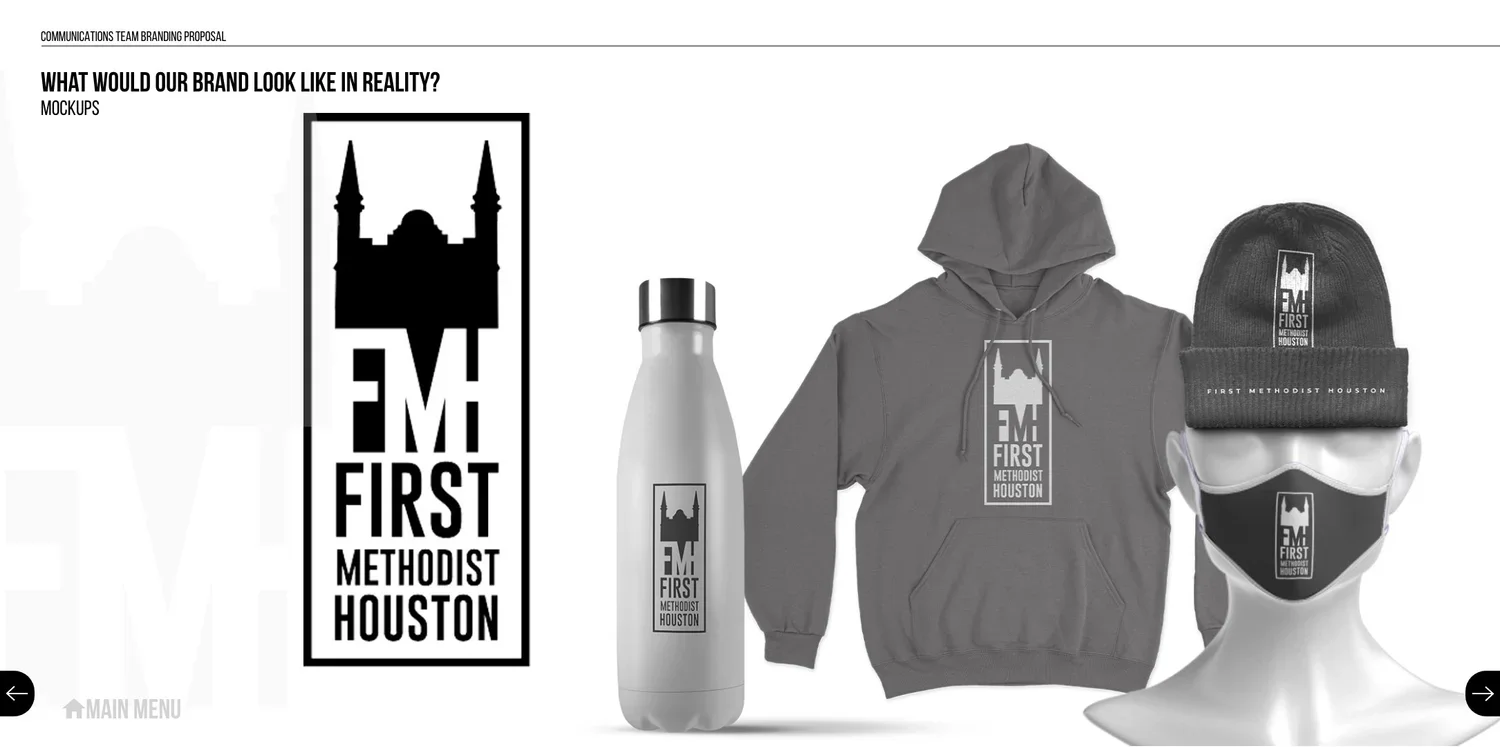
We made sure our first design was something simple, clean, and above all, flexible. Something where we didn’t just love the design, but were able to show how the design would work in all different facets across both campuses.
Pitch 2: Traditional Design, Unconventional Formatting
We wanted our next pitch to feel significantly different from the first pitch, so that the series didn’t just feel like shades of the same concept.
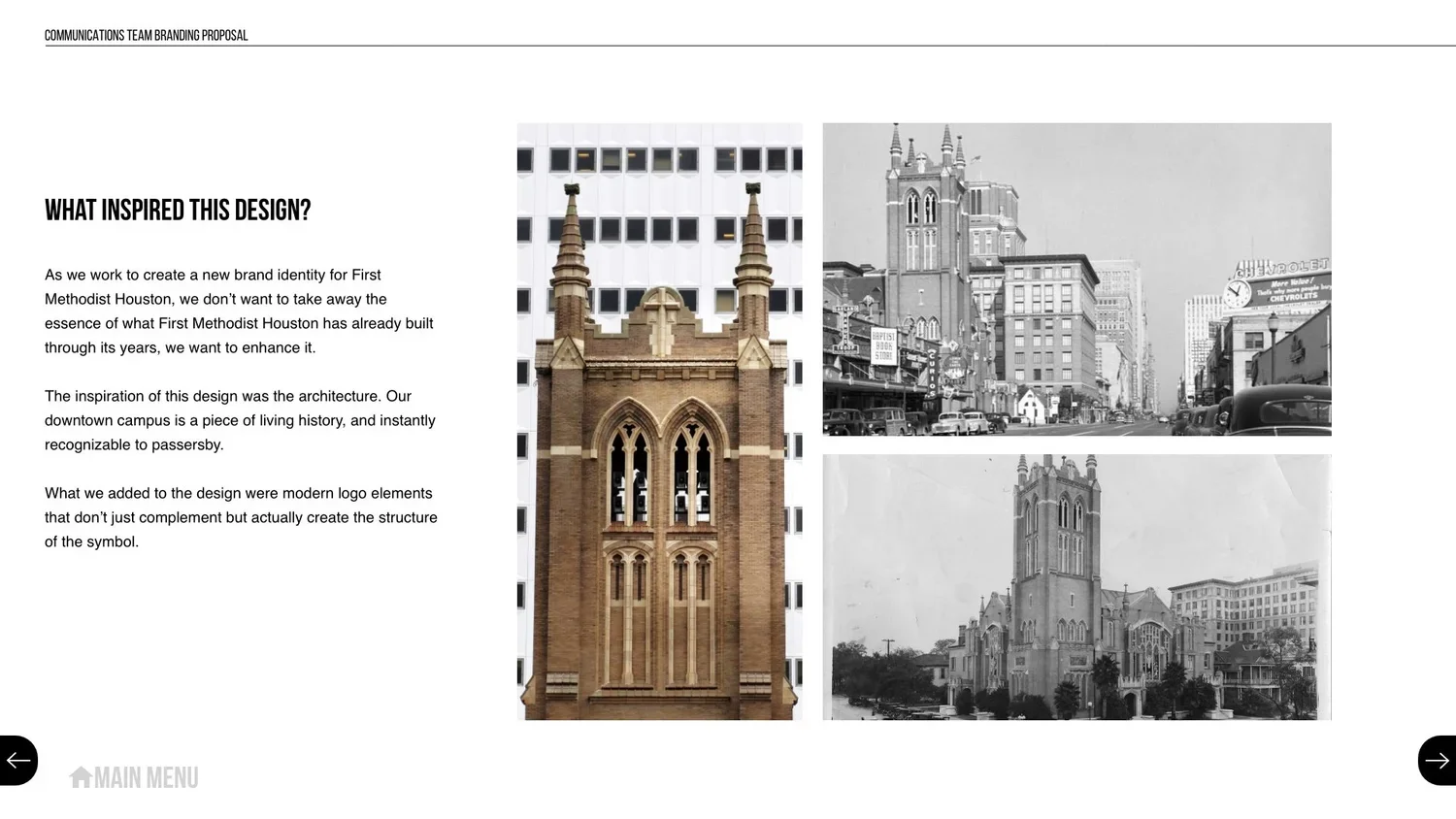
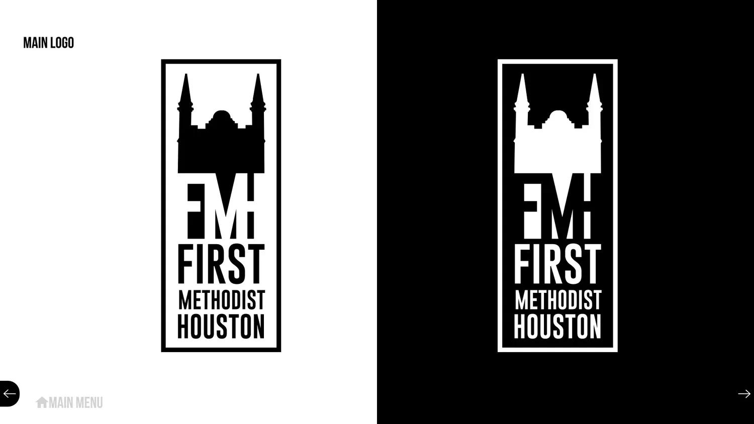
For this one, we focused on our bell tower, and the symbol it is within the city.
Pitch 2: Traditional Design, Unconventional Formatting
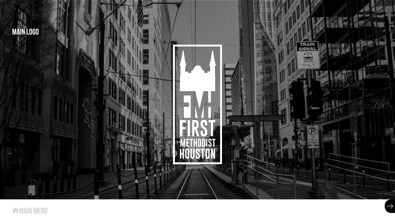
We wanted our next pitch to feel significantly different from the first pitch, so that the series didn’t just feel like shades of the same concept.
For this one, we focused on our bell tower, and the symbol it is within the city.
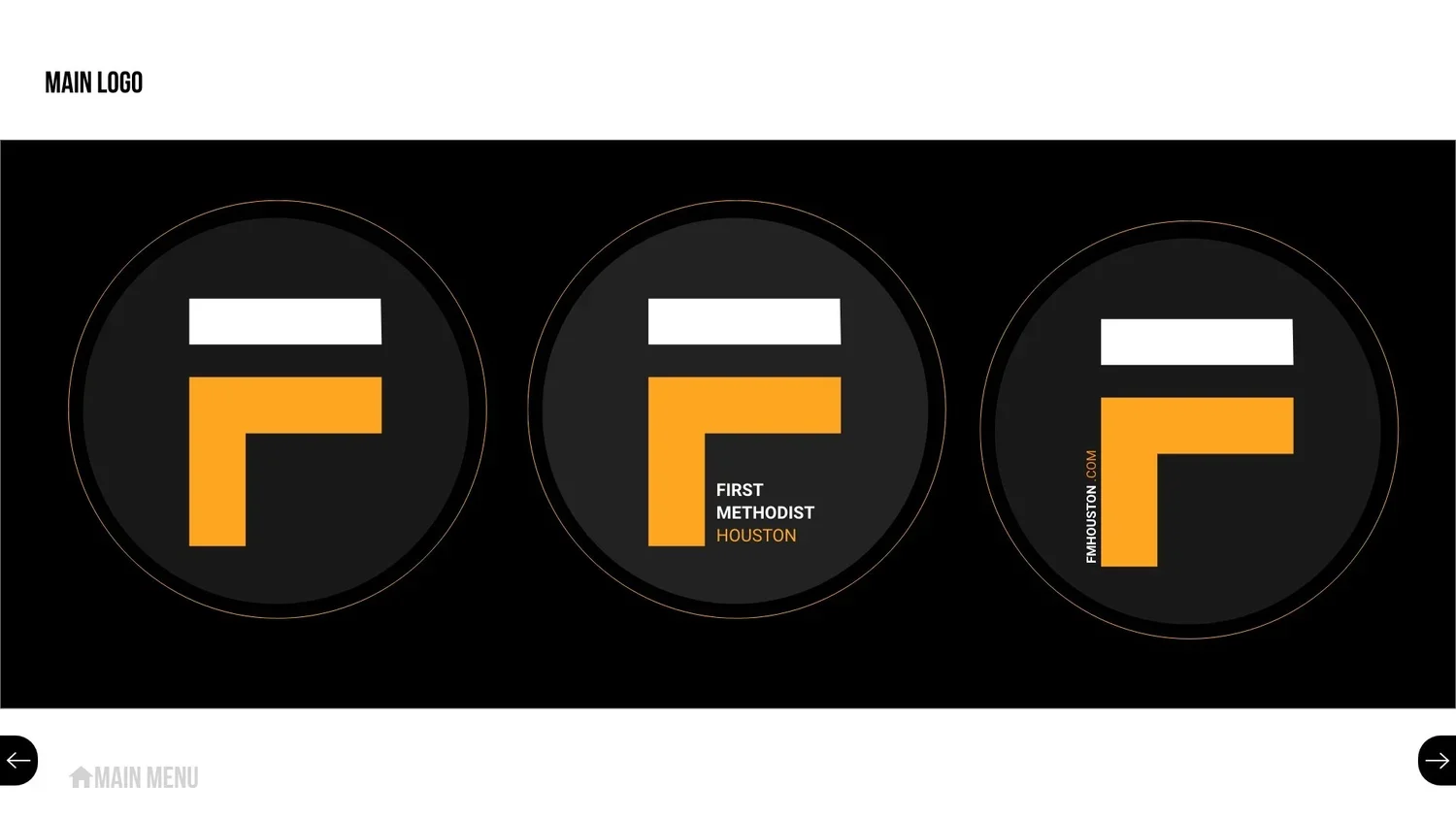
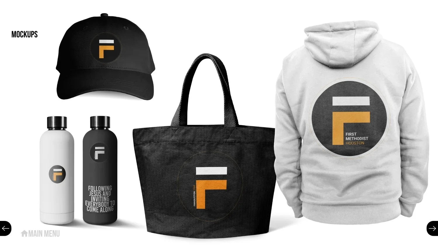
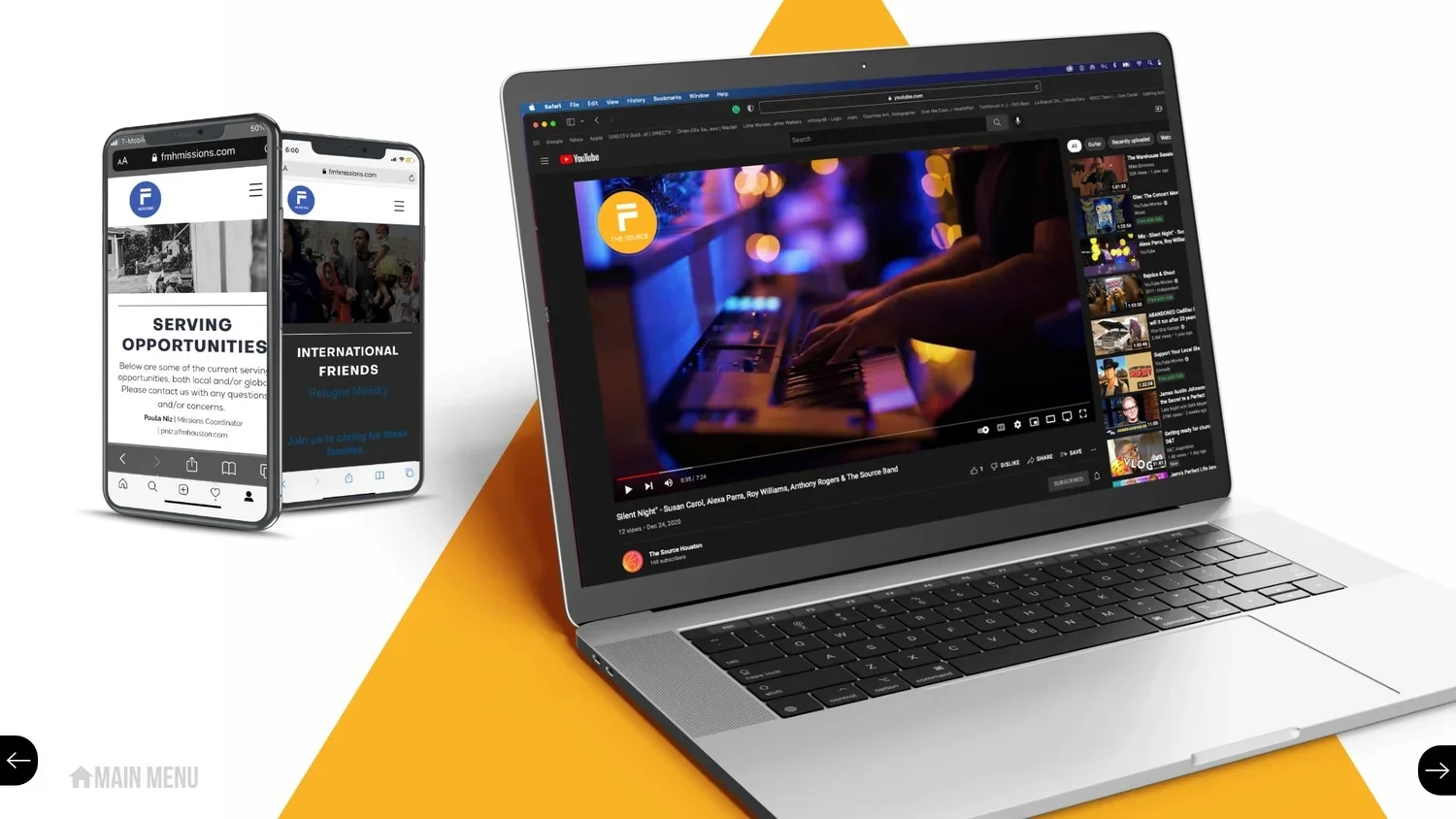
Pitch 4: The Church As Symbol
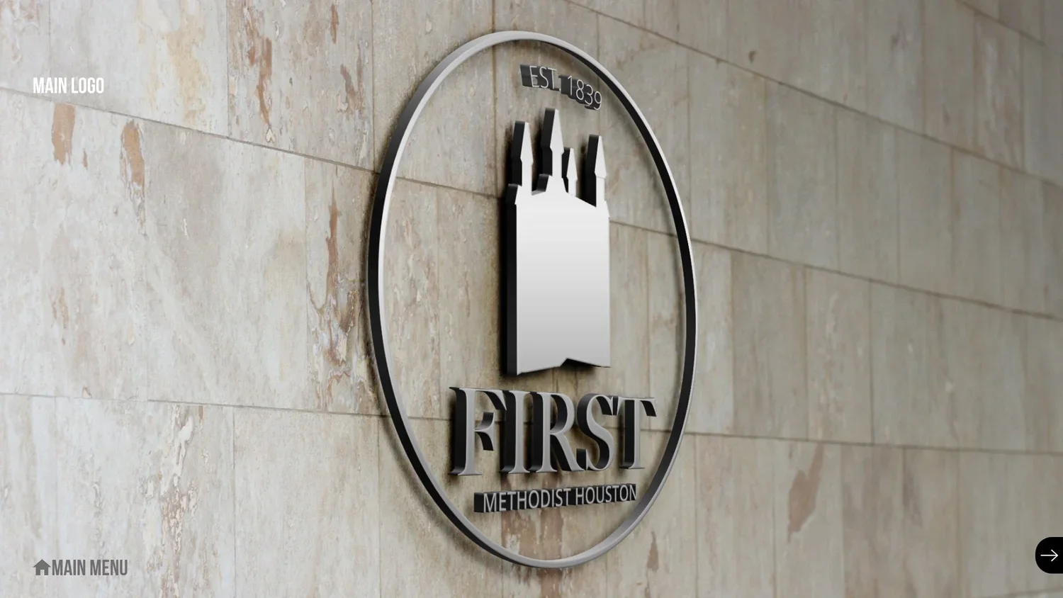
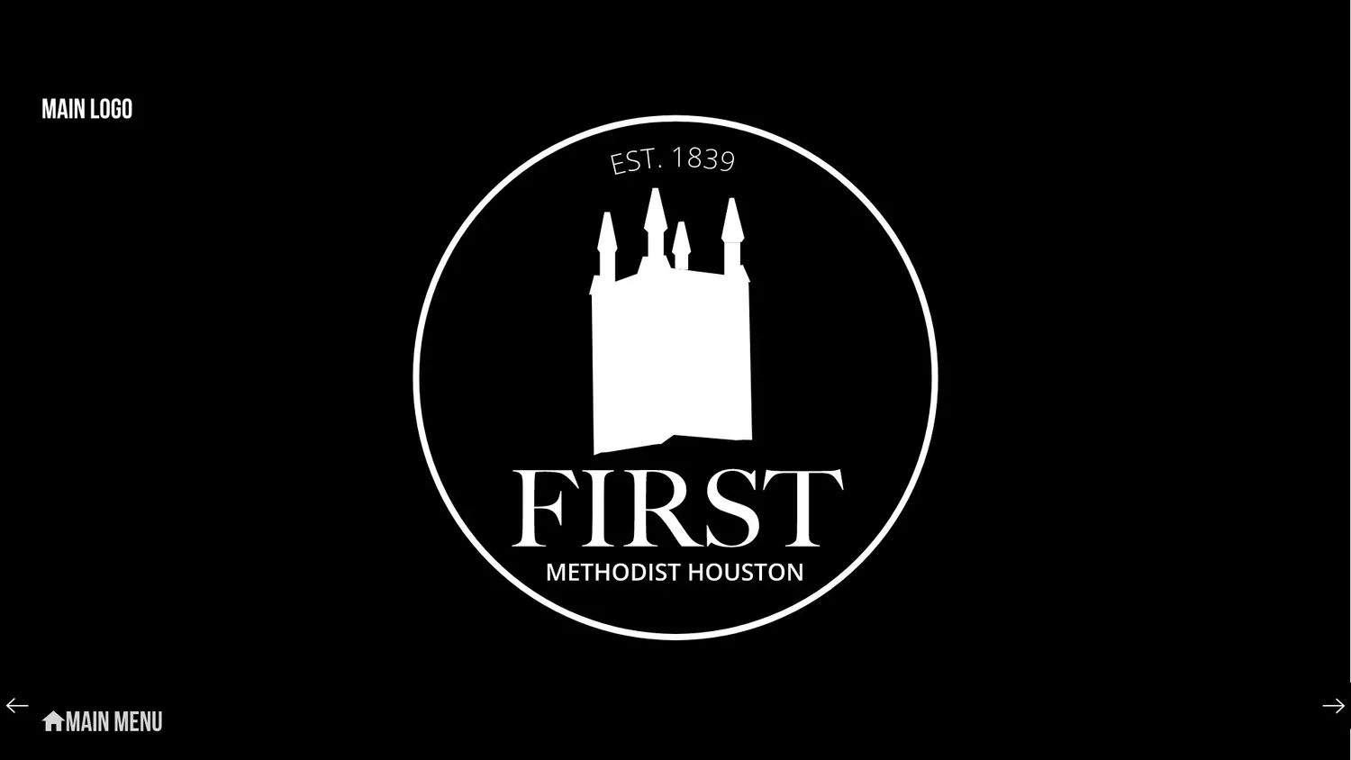
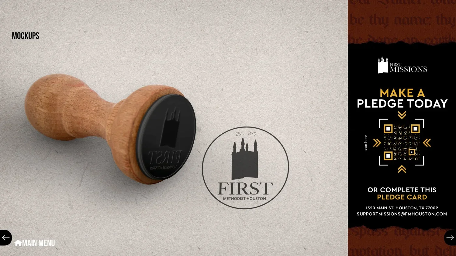
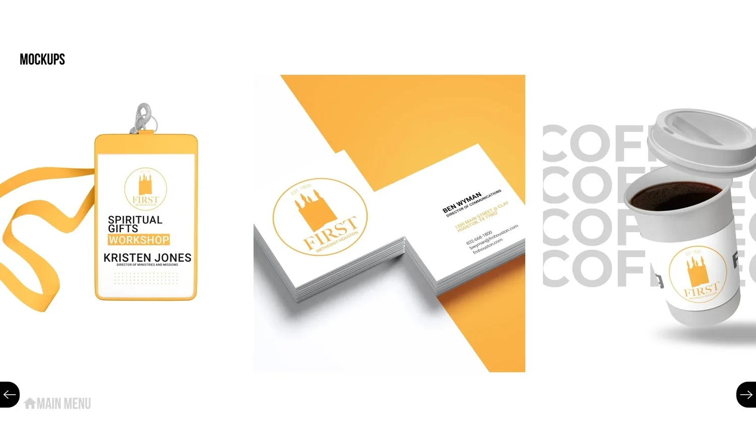
Once again, we zagged away from the previous pitch to go back to something much more traditional. This time, we really centered the bell tower as a traditional symbol - but encased in a circle, like a stamp, a blend of old design and new trends.
Pitch 5: The Stained Glass
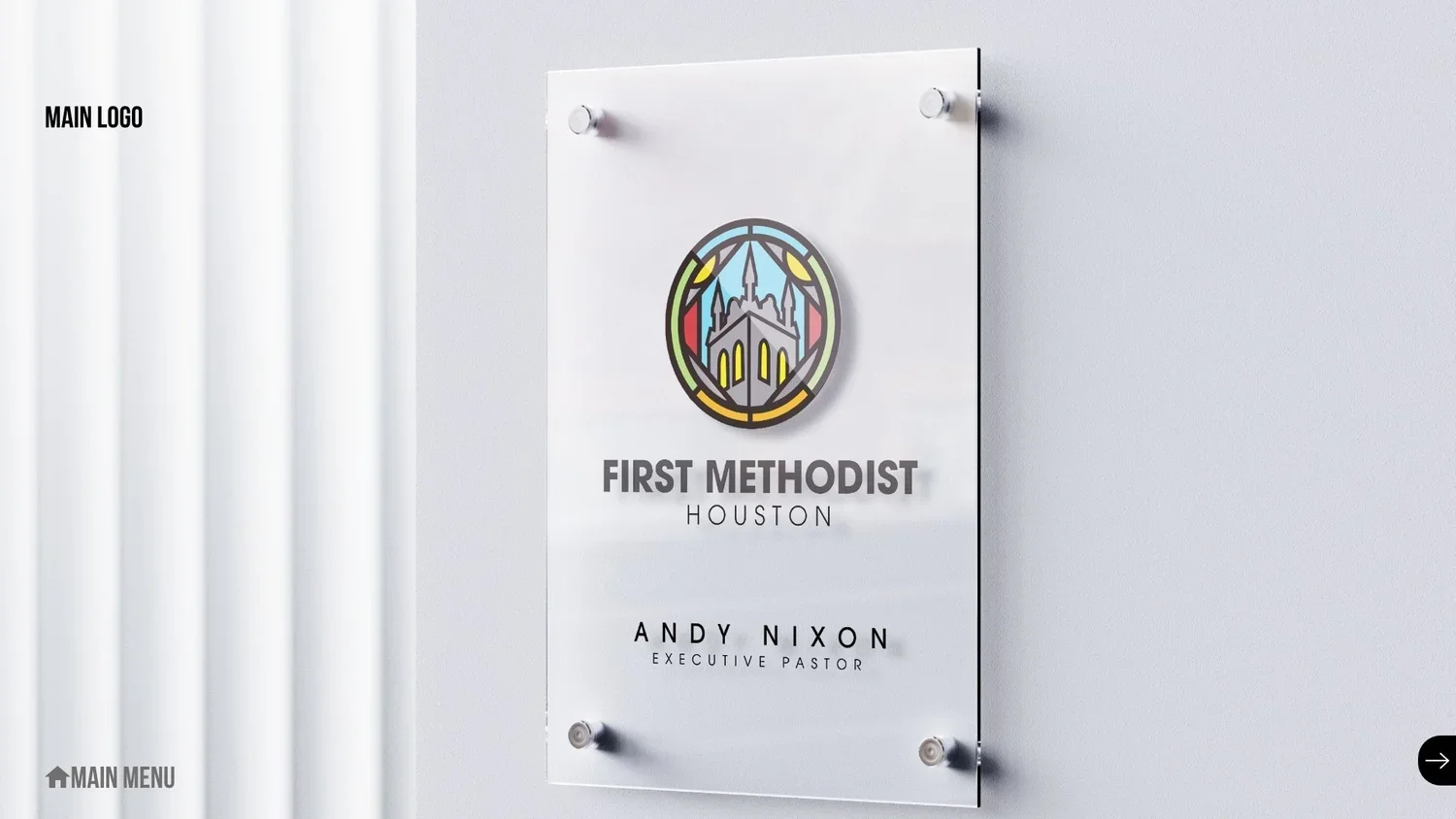
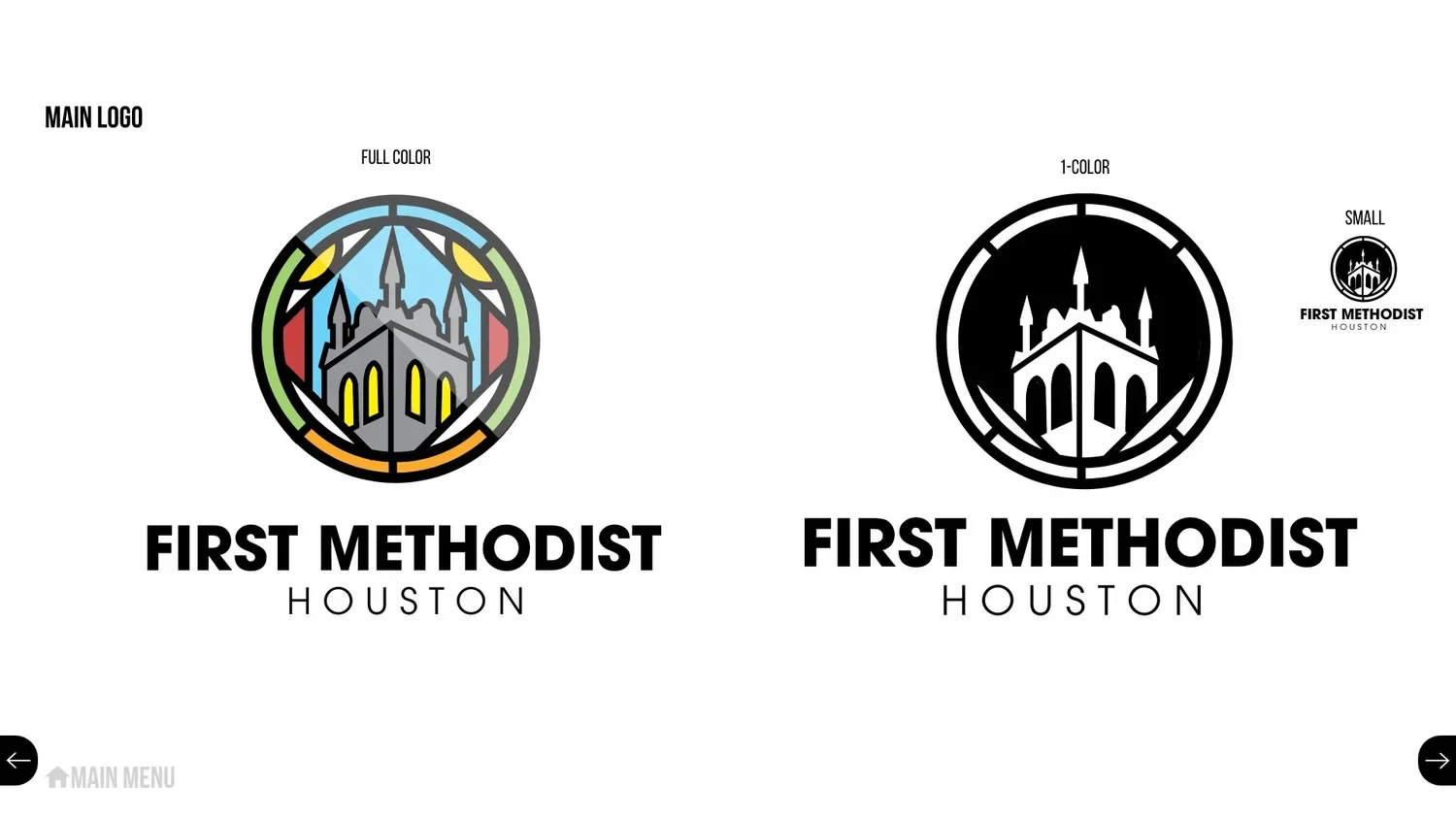
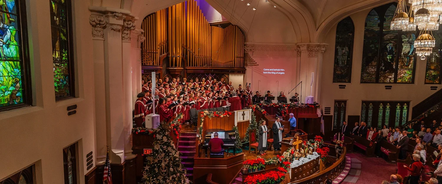
The center of First Methodist Houston’s identity as a worshiping community is their historic downtown chapel, featuring giant pieces of stained glass art, many of them entirely unique to the church.
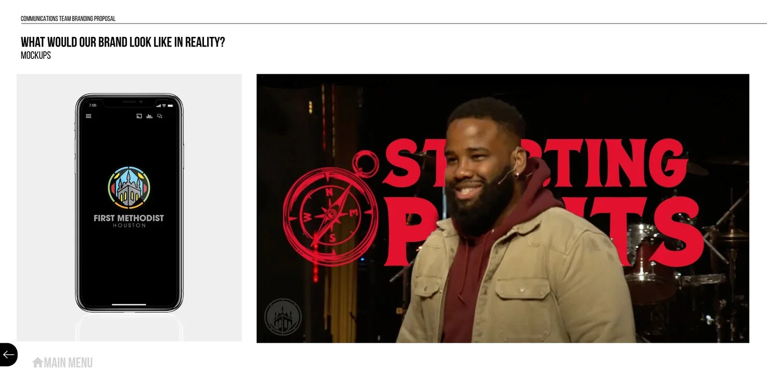
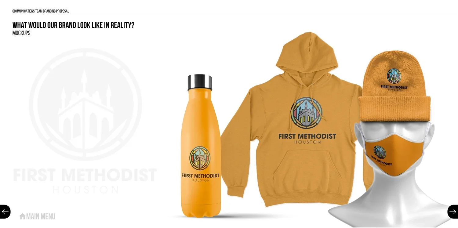
So we designed a logo around that identity: