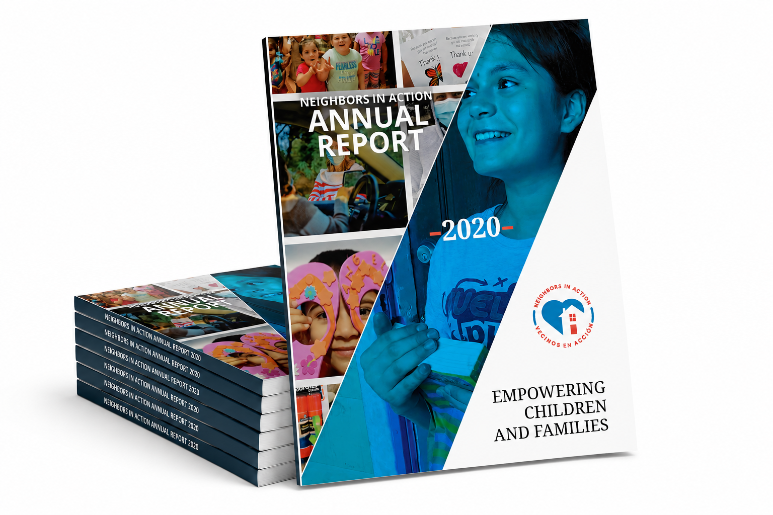
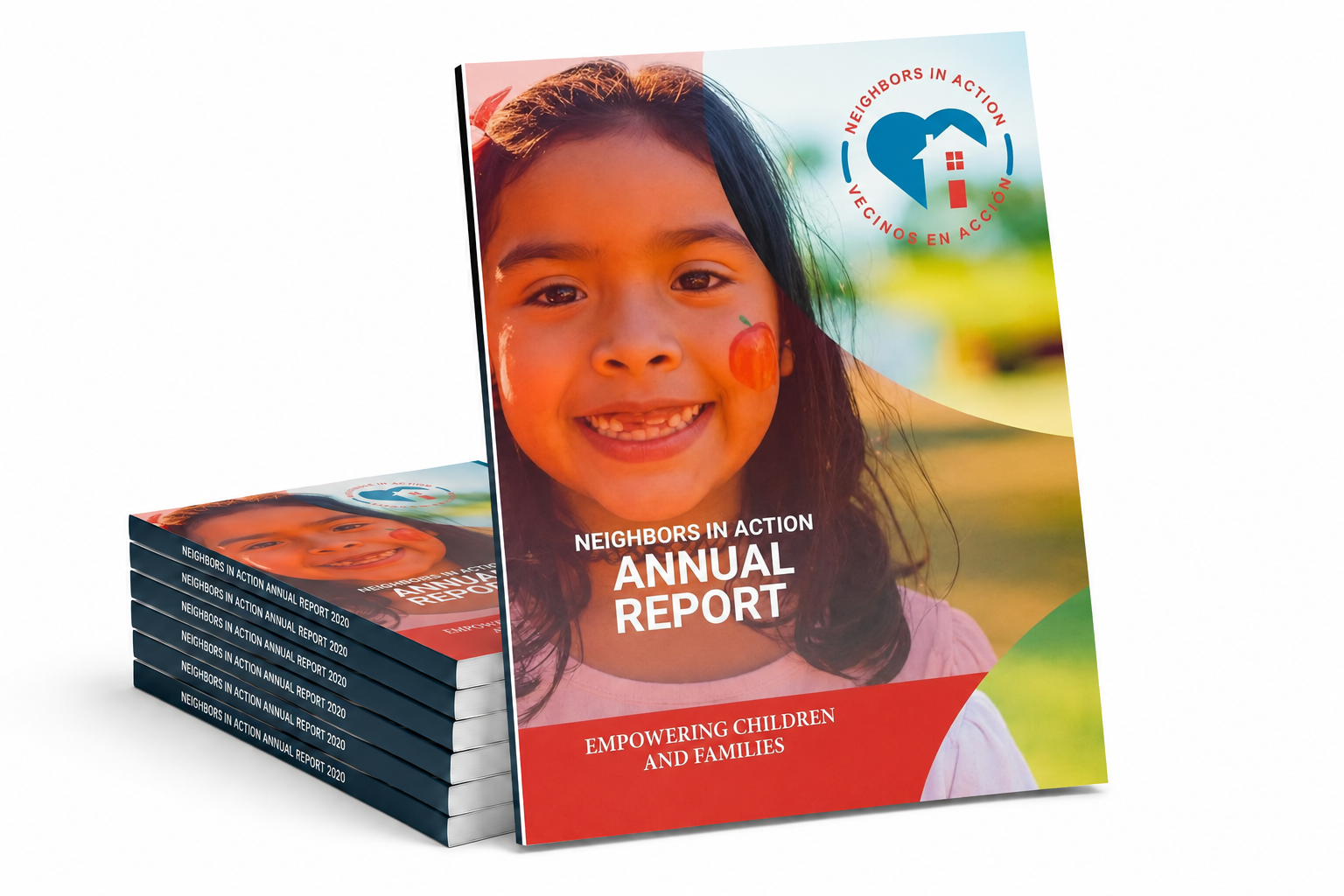
Neighbors In Action partners with families in Port Houston and surrounding communities to create lasting change through spiritual growth, education, and essential support.
These annual reports showcase the organization’s impact through compelling photography, engaging infographics, and heartfelt stories—bringing their mission, the people they serve, and the difference they make to life.
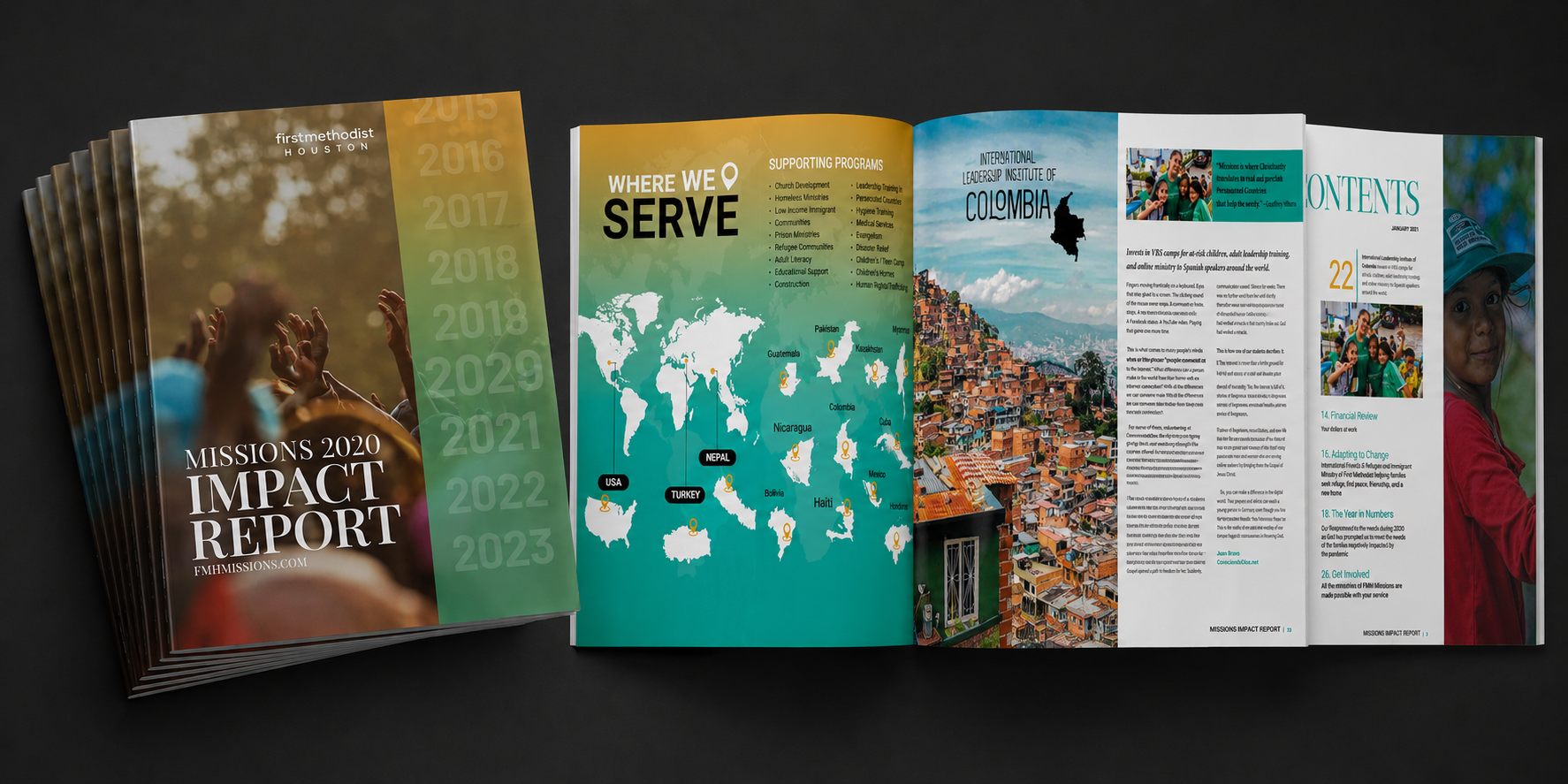
Mission 2020 Impact Report highlights how the ministries of First Methodist Houston responded to Christ’s call to care for the poor and oppressed, both locally and around the world.
The report was designed as a visual storytelling experience, using thoughtful editorial layouts, impactful photography, infographics, and compelling typography to guide readers through the stories behind the mission. A clear visual hierarchy and intentional pacing helped transform complex information and individual stories into an engaging narrative that communicates both the breadth and the human impact of the ministry.
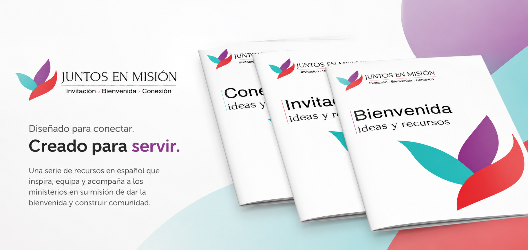
Juntos En Misión is a Spanish-language resource created to equip ministries serving newcomers and support Spanish-speaking congregations. The program features a five-part video series accompanied by three workbooks designed to guide participants through each stage of the experience.
The visual system was designed to create a cohesive and approachable learning experience across video and print. Clear layouts, intuitive typography, and thoughtful organization made the workbooks easy to navigate while reinforcing the content of the video series. Together, the materials create a unified visual identity that helps participants engage with the program and its message.


Diolog: The Texas Episcopalian
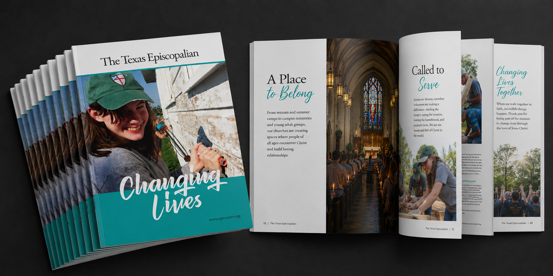
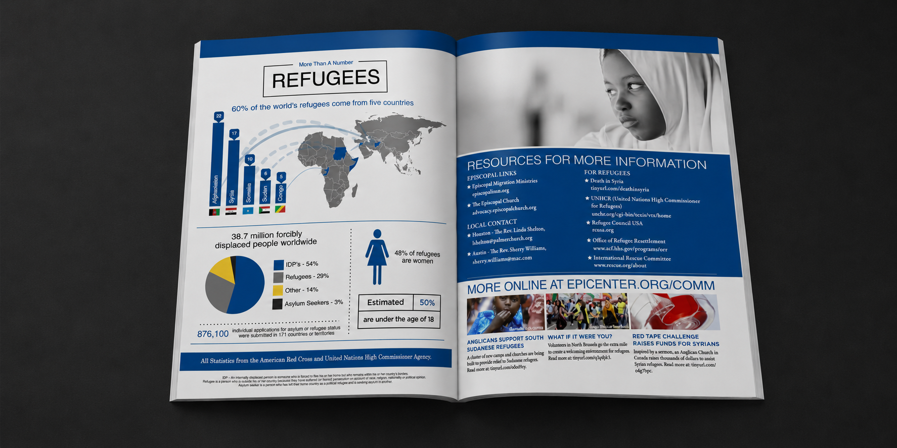
Diolog: The Texas Episcopalian was the official publication of the Episcopal Diocese of Texas. From 2011–2020, I produced the quarterly publication, collaborating with writers, photographers, and editors to develop a cohesive editorial experience for a global readership of more than 80,000.
As publication designer, I managed the visual direction and layout from concept through production. Each issue was built around a flexible editorial grid and consistent typographic hierarchy, allowing long-form articles, photography, feature stories, and informational content to work together seamlessly. Thoughtful image placement, pacing, white space, and varied page compositions created visual rhythm while guiding readers through each story.
The publication required balancing editorial requirements with strong visual storytelling—translating diverse content and photography into a polished, accessible, and engaging print publication. Having my work placed in the hands of more than 80,000 readers around the world each quarter remains one of the highlights of my career.
Below are a few of my favorite layouts from the publication.
TOWARDS A BELOVED COMMUNITY: FACING RACISM Sept. 2015


HUMAN TRAFFICKING: IN PLAIN SIGHT Dec. 2012